Wednesday, March 29, 2006

The House of Ideas

Well, there's not a huge amount to say about these images, they pretty much speak for themselves.

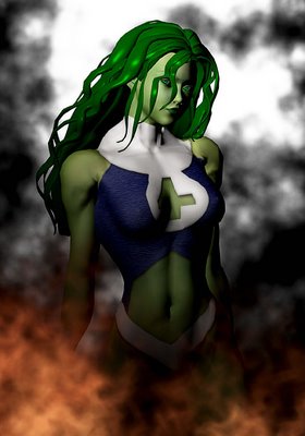
First up we have the lovely She-Hulk. Some of you might know that I am a HUGE fan of Marvel Comics, and it's always been my dream to work for them. Well, despite having read something like three thousand Marvel comics in my time, I've read very few featuring She-Hulk. Her look has always fascinated me, however. There's just something sexy about a big, green mucle-bound woman.

The She-Hulk figure I've used here isn't great, and I'd really have to come up with something else if I was going to be producing a lot of different pictures of her (I'd probably base it on Daz's She-Freak). I had to go in and completely revamp the texture, because it was incredibly low res. Her costume looked pretty much painted on to her body (which, technically, it is), so I added some texture to the blue part and some drop shadows and embossing to the white parts to make it look more like she's wearing clothes, as opposed to body paint.
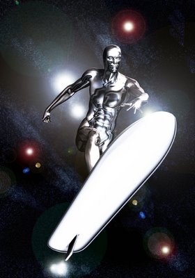
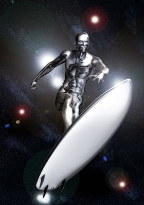
Next up we're revisiting my pic' of the Silver Surfer. Chuck Sellner at Visionary kindly pointed out to me that the Silver Surfer doesn't have any ears, so I've fixed that here. I've also replaced the surf board model with one that's a bit more appropriate for the character.

It looks like I might be doing a little something with this character soon (that's as much as you're going to get out of me on this for now). I'm no longer doing the art for Project HERO as the writer decided that my style wasn't what he wanted for the book after all, so I've got some more time on my hands. I'll be announcing a few new projects over the coming weeks, both in the realms of CG art and comic book colouring (and lettering!).

It looks like my first project with Supreme Knight is finally on the cards. It's early days yet but it looks like I'm going to get another chance to flex my colouring muscle. At the moment, it seems that every time a door closes on me, three open up in its place. Now I just need the financial security to enable me to do this full-time!
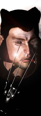
Lastly we have a picture of everyone's favourite Canadian mutant, Wolverine, aka Logan. This one pretty much speaks for itself. You combine the claws, the snarl, the hair...and a smoking cigar...you've got an iconic image of Wolverine. Sure, he's been the victim of gross over-use, but forget that for a minute, at the core we have one of the coolest, most complex characters in comics. Simply put - is there a man inside this beast struggling to get out; or is there a beast inside this man.

To me that was always the essence of Logan's struggle, his quest, if you like. He's on a journey to discover what truly lies at the core of his being.

Okay, well that's it for the Marvel renders for the time being. Check back tomorrow for some Young Gods action, it'll knock yer' socks off!

Monday, March 27, 2006

Stan Lee's Silver Messiah

Well, I'm taking a break from working on Project HERO so I thought I'd work on some pic's of Marvel characters (before I switch to concentrating on the Young Gods for the rest of the week!).

I guess this was an obvious choice, but what Marvel character is going to look better rendered in CG than the Silver Surfer? To get a bit of a different, alien, perhaps god-like feel to him I decided to use Daz's David figure, as opposed to Michael. I already had the base figure and the head and body morphs were on sale so it didn't cost too much. The main tweak I made was lengthening the arms, legs and neck to further enhance the alien, god-like nature of the character. The texture was courtesy of animotions.com, who have a rather useful Silver Surfer texture for free. The texture comes with a surf board prop, but I didn't like it and a quick search of Renderosity's free items turned up this much better example. It was just a matter of extracting the texture settings for the Silver Surfer and applying them to the board.

The star-field background was created in Photoshop. A quick Google search turned up a great tutorial which has enabled me to achieve quite a cool background. The background and the Surfer were then composited in Photoshop, with a few layer effects added to give the image some added zing. Lastly a simple lens flare was added to the top of the surf board as a finishing touch.

I've also started working on a Wolverine picture, but I've not had time to finish that tonight. It's pretty much done, so it should just be a matter of rendering it tomorrow night before moving on to working on The Young Gods.

I also have another pin-up to colour for Of Bitter Souls and....ta da....I've also agreed to colour the whole of #5 of Smoke & Mirror! This is a huge opportunity for me and I'm really enjoying colouring. I'll keep you posted as things progress in that area.

But...hey...just look at that Silver Surfer pic...

...cool...

Friday, March 24, 2006

Demons, Poser 6 and Marvel Comics


Well, hopefulyl Chuck won't mind me posting this here, it's my second piece of colouring work for Of Bitter Souls. I'm pretty pleased with this one. It was a little more thought out than the last one as I'm starting to get to grips with what I'ma ctually doing! I'm hoping to do some more colour work for Chuck soon, and I'll keep you posted.

Last nigth I installed Poser 6 (at last!) and it's definitely going to help speed things up. The spot render tool is especially useful. I haven't had much chance to explore all the new features yet but I've already put it to use working on another reworking of pages 4-5 of Project HERO. I always knew this spread was going to be tough to get right but I think we're just about there now.

I really want to make some decent progress on Project HERO and The Young Gods now, everything's going so frustratingly slowly. It hasn't helped that my office is the coldest room in the house, and we've had some really cold nights recently, so marathon rendering sessions 'till 3am have been made especially uncomfortable. Hopefully I can pick up a small electric heater this weekend which should make a big difference!

Okay...so I've dealt with the demons...and Poser 6...what was the other item in the heading? Oh yes....Marvel Comics. Well, Visionary are putting together a package to showcase all of their artists' and writers' work to Marvel Comics, which means that my CG art and my colouring will be viewed by some of the most important people in the industry. This could seriously lead to the kind of work that would enable me to give up the day job. Visionary have asked me to produce a CG cover image featuring a Marvel character....which will be quite a challenge. Hopefully I can get that done this weekend. I'll be posting it here as soon as it's finished. If I have the time, and it works, I want to do a few Marvel images, I've got in mind at least three pics, one of Wolverine, one of Sue Storm and possibly an Avengers pic. Oh...might do the Silver Surfer too. Oh...and Spider-Man!

Thursday, March 23, 2006

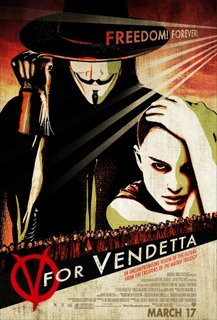
Movie Review: V for Vendetta

"An artist uses lies to tell the truth."

Back in the early eighties Alan Moore created a comic book which now ranks among the classics of the genre. I must confess I haven't read it...yet. While undoubtedly a bit of a nutter, Moore's contribution to the industry is immense - The Killing Joke, Captain Britain, From Hell, The League of Extraordinary Gentlemen, The Ballad of Halo Jones, Watchmen and, of course, V for Vendetta - just a small sample of his immense bibliography. However, if you're looking for his name on the credits of this movie adaptation, you won't find it. Why? Well, Moore is best described as but one in a long line of grumpy old men who are, undoubtedly, a British institution. Whereas most of us would give our right arms to work for Marvel or DC, Moore has vowed to never work with either again - nice to have that kind of luxury. He also refuses to be credited on any movie adaptations of his work, and refuses any money from them. So...as I said...a bit of a nutter, really.

I must confess that I haven't actually read a vast amount of his work...I have the collection of his run on Captain Britain (one of my all-time favourite heroes) and I loved his run on WildCATs. The "classics" however, Killing Joke, Watchmen and V for Vendetta, seem to be fated to be permanently on my "must read" list. Ah well....

So, I can't comment on how faithful an adaptation of the source material this is, all I can do is judge it on its own merits. How does it fair? Well....pretty damn well. Actually, that's an understatement. I think V very well may end up being my movie of the year.

I really don't want to spoil the plot for anyone who hasn't seen it yet, I think the less you know going in, the more impact the film will have on you. Suffice it to say that in the current climate I admire anyone who makes a film where the central character is a terrorist who blows up landmarks in central London...and manages to win us over to his side.

Vendetta is incredibly relevant to the current post 9-11 world we live in. One of the central, and most challenging, question it asks us is, "If our own government were responsible for the worst terrorist attack ever perpetrated on home soil, would we want to know?" I've made no secret of my opinion of who was truly behind 9-11 (and most likely behind 7-7 too) and, personally, I think the world has already answered this question with a resounding, "NO." Casting John Hurt in the role of the Big Brother like Chancellor was a masterstroke, creating in one's mind a direct connection with Orwell's 1984.

Weaving is also masterful as the titular V, and considering he wears a full, static face mask throughout, manages to convey such emotion, such pain, such passion...he deserves an Oscar. Portman is equally perfect (possibly in every way!), and though I've heard grumblings about her accent, it's actually very good and never distracts us from her performance. Stephen Rae and Stephen Fry are also superb in supporting roles.

The visuals are stunning, the script is a masterpiece, the performances are perfect. This film is both thrilling, and chilling too. It resonates so perfectly with our current age. The main complaint/criticism I've seen of this movie is that it actually require you to think. Well, that's no bad thing. This is an ambitious film which leaves you with many questions.

In short, go and see this, it's as close to perfect as films get.

Rating: 10/10

Tuesday, March 21, 2006

500 hits!

This little old blog has finally reached the 500 hit mark. Thanks to all the regular and not-so-regular readers, from the UK, the US, Norway, Spain and many other places, who've helped me rack up the numbers. I guess this is where I stop celebrating every hundred hits, the next milestone being 750, and then 1000!

I'm reliably informed that the official Magneto biography on marvel.com now includes a link to the Magneto FAQ hosted on the CHC Forum. That section of the site has seen a large increase in traffic as a result and over the next few weeks I intend to revamp the CHC Forum to bring it more in line with the contents of the blog. It would be nice if some of the regular blog readers started posting in the forum so we could start to create our own little community.

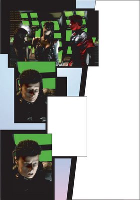
As for the pic' that accompanies this post....well...I did say I was expecting to have to make some changes to pages 4-5 of Project HERO. You should soon be able to check out the Gallery section of the Supreme Knight website for a permanent showcase of my work.

I'd like to say a big, public "Cheers!" to everyone who's said nice things about my colouring on the Of Bitter Souls pin-up. I'm currently working on the colours for another pin-up for Of Bitter Souls, which I should complete tomorrow.

Assuming there are no more changes to pages 4-5 of Project HERO, I'm determined to get some work done on page 4 of The Young Gods. I need to download a new model for the drones (robot sentries that the team take on in their first battle), but other than that it should be a fairly straightforward page.

That's all for now, if I get the time I'll be posting my review of The Pink Panther tomorrow (here's a tip, if the choice is seeing V For Vendetta or The Pink Panther, don't tell your wife that you really don't mind what you see...).

Saturday, March 18, 2006

Of Bitter Souls

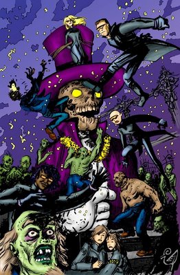
Zombies ahoy!

I guess it's ok to post this as Chuck's already put it up on the Markosia forum. Anyway, this pin-up, which I've provided the colours for, is set to appear in the Of Bitter Souls trade paperback which is coming soon from Markosia (I'll let you know exactly when it's coming out as soon as I can). I guess I recently officially became a "professional" comic book artist when I received a cheque from Markosia for a couple of pin-ups I did for The Lexian Chronicles which they haven't used (and I don't blame them, really...I was pleased with them at the time but looking at them now I could do so much better, and I'll be redoing them as soon as I have the time). This colouring work, however, should see me officially become a "published" comic book artist as Of Bitter Souls creator Chuck Satterlee has said on the Markosia forum that it's definitely going in the trade. So now I owe Chuck two as it was apparently him who suggested that Visionary get in touch with me regarding Project HERO.

This page was a real blast to colour. I love zombies and some of my favourite films are zombie movies. I was trying to evoke a feeling of those old EC horror comics with the colours on this. I didn't specifically reference any of that stuff, but that's definitely the feel I was going for.

In case anyone out there's interested in my colouring technique. I tend to lay down basic blocks of colour, choosing mid-tones for each area. Then I add shading and highlights using the dodge and burn tools in Photoshop. There are as many ways to colour comics in Photoshop as there are people, it would seem, but I'm really comfortable with this method. It just seems to work for me. The background is a gradient fill on a seperate layer. (Well, there's a little more to it than that, but I'm not going to share all my secrets!).

Hopefully this will be the first of many colouring jobs. Like inking, you never get that daunting "staring at a blank page" moment with colouring.

Elsewhere in the wonderful world of comic book art, I've been discussing some changes to pages 4-5 of Project HERO with Chuck (Sellner) from Visionary, and the subject arose of how delicate some comic book artists can be when their work is criticised, or changes are asked for. I found it mildly amusing that Chuck went to great lengths to reassure me that they still loved my art even though they were asking for changes. Coming from a position of working as a professional graphic designer I'm used to spending hours on a piece which I think is absolutely stunning, only to have the client turn around and rip it to shreds and ask for it to be completely changed (while admitting that they don't know anything about design but they know what they like). These people have no consideration for your feelings as an artist, and why should they? At the end of the day they are paying you to fulfil their vision....not your own! It's exactly the same in the field of comics. Yes, comic book art is art...but it is commercial art. I feel sorry for editors who have to constantly deal with bruised egos and so called "artistic temperaments." It's unprofessional and it's detrimental to the business as a whole. If you want to make it in this business (and I have in no way made it yet) you have to have a thick skin and actively welcome criticism.

Phew...rant over.

Friday, March 17, 2006

Busy, busy, busy....

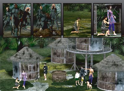
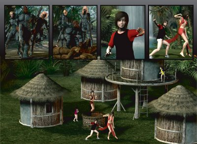
Well, Project HERO has seen me achieve yet another page that's had me awake at night wondering if it's actually possible to produce it in Poser. Firstly, I should say that I've yet to have editorial feedback on these pages, so there's a fair chance that they could change, but I really wanted to update the blog and share them with you all.

The big splash panel required an aerial shot of a Korean jungle village with villagers. Now, I would have liked more villagers, but my computer just flat out said no to me. The compositing route wouldn't really work with this image either, because it's important that everybody and everything casts shadows here. Several layered on figures casting no shadows would have just looked wrong. Still, to produce a picture like this using Poser is quite an achievement in and of itself. Of course, more memory, a faster processor, and the latest version of Poser would probably let me add more figures to the scene, but none of the above are an option right now. When I'm doing this full-time professionally and there's money to spare, I'll definitely be getting a dedicated 3D workstation PC though (although I put together my "dream" workstation PC package on one website recently and the total cost came to £6,000! When I do finally get my dedicated workstation I don't think it'll be quite that fancy...).

I'd also like to draw your attention to the dead soldiers in the second panel, whose uniforms saw my most extensive texture editing to date. Click on the pic above for a better view.

In other news, as well as working on Project HERO and The Young Gods, I'm also colouring a couple of pin-ups for Chuck Satterlee over at Markosia. I'm currently working on a pin-up for Chuck's Of Bitter Souls series and he'll be sending me over the line-art for the second pin-up soon. Don't know exactly when, where or if these are going to see print but rest assured I'll be announcing that here as soon as I know. The colouring is a nice change of pace for me, and it's something I can do at lunch while I'm at work. I'm trying to keep as many strings to my bow as possible so that if the work dries up in one area it'll keep coming in another. I know that the ultimate decision to give up my nice, secure full time graphic design job and plunge head first into the life of a full time, freelance comic book artist is a massive risk, and I need to do everything in my power to minimise that risk when the time comes. It would be great to have regular work in all my areas of expertise - 3D art, inking, colouring, plotting and writing - but I suspect that there probably aren't enough hours in the day for that to be feasible.

Talking of writing, I'm currently mulling over the idea of publishing Elephants From Norway Go Mad In Winter via Lulu.com. I'm undecided on this right now. A couple of people have read it recently, and have really enjoyed it. I wrote it over ten years ago though, and...well...I'm just not sure. I really think I should go over the whole thing again and rewrite it...but...I just don't have the time for that. Maybe it's something to keep in the back of my mind for when I have the time. I am very fond of it though, and it's always seemed a shame to me to leave it gathering digitial dust on my hard drive.

Well, that's all for tonight, really. V for Vendetta comes out tomorrow so hopefully I'll have time for a trip to the cinema this weekend.

Monday, March 13, 2006

The Young Gods: Page 3! Completed!

Well, given that it's now 3.30am, there's little more I can say than - here it is, at last, the complete page 3!

Saturday, March 11, 2006

At last! We're moving again!

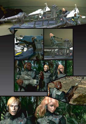
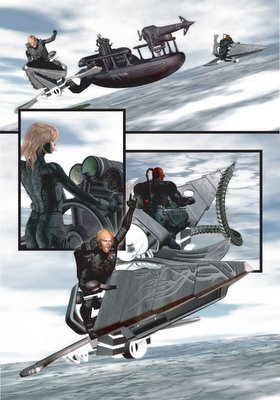
Maybe it's something to do with page 3's? Everything was going so smoothly with the renders for Project HERO until Page 3, Panel 1.

I just couldn't render this panel...it would get so far and then stop, every time. Eventually I traced the problem to the texture for Gawain's head, reduced the resolution and...it almost worked... So I moved Gawain behind the boat - problem solved...until Panel 4.

Now...looking at Panel 4, there was no way that I could fudge it and move Gawain behind something, so I had to solve this problem once and for all. Of course, I really should have known better, the same texture that's on Gawain's head is also used for inside his mouth, up his nose and his lacrimals (look it up!). So...I reduced the texture from 4000x4000 pixels down to 2000x2000 pixels...made sure to replace it on every part of the head it's used on and...voila!...the panel rendered perfectly.

For this page I've also added the "Pentagram" insignias to the textures for the outfits, rather than adding them in later in Photoshop. Generally, the more you can do in Poser, the better. Working on Project HERO has forced me to learn how to edit texture maps, which is a good skill to have. It means that my future work is likely to get less and less generic, and I'll be less and less dependent on off the shelf stuff. I'm still a long way off from learning how to model though!

In other news, The Young Gods was favourably received by Visionary but, after a lot of debate and angsting, Derek and I decided that Visionary probably isn't the best home for it. So, work continues on the project. We're aiming to get the first five pages complete and then we'll be putting together another submission package to send out. So, watch this space!

Finally, I booked my trip to the upcoming Bristol Comic Expo this week. I'll be meeting up with Derek for the first time at the con, and we're anticipating a couple of late night, alcohol fueled story conferences. The con's being put on "in association with" Markosia (whatever that means) so you can expect to find Derek and me hungover and hassling Harry and the gang. We'll both be arriving in Bristol on the afternoon of the 12th, so if anyone's interested in some pre-con partying, drop us a line! (Y'know...as much as us geeks "party"....). The big news, so far as I'm concerned, is that both Walter and Louise Simonson are going to be attending. I am a HUGE fan of Louise Simonson's writing. I loved her run on New Mutants (probably more than Claremont's) and, of course, they worked together for a time on X-Factor.

Well, I think that's everything for now, time for some sleep....

Thursday, March 09, 2006

Movie Review: The Weatherman

Between submitting The Young Gods to Visionary, working on Project H.E.R.O. and the million and one other things going on in my life I haven't found five minutes to update the blog this week. I did find time to see The Weatherman last night, though.

I wanted to see Mirrormask but none of my local cinemas seem to be showing it which is seriously annoying.

The Weatherman starts slow, is slow in the middle, and at the end, maintains the pace with more slowness. Don't let that put you off too much though, because your patience will be rewarded with a very moving story and some excellent performances by some of the worlds finest actors (like, Michael Caine).

This is, in many ways, the male equivalent of a chick flick. By that, I mean, it ticks all the right boxes to get guys to openly weep into their popcorn. Basically, if you have a dad, and most of us do, this movie can't really fail to touch you. Well, assuming you're a normal bloke who find's it almost impossible to communicate to your dad exactly how you feel about him, how much he really means to you, and how much you feel like you've completely failed to live up to his expectations.

There's a lot more going on in this film, as we follow the main character's journey to accepting that he is who he is. The cast are excellent, the direction very sensitive. But...yeah...it's slow...and if you like explosions or belly laughs from your cinema, and not a lot else, you're going to hate it.

So, not recommended to everyone, but definitely recommended.

Rating: 8/10

PS: Hopefully I'll be posting some more artwork later!

Sunday, March 05, 2006

It had to happen...

Yes, it had to happen eventually...so now you all know what I look like...sort of...

Well, after months of hiding behind that old picture of Outrage from The Young Gods, I couldn't just reveal all, could I?

Ok, what's the latest news? Well, in the world of The Young Gods, we're going to be submitting the book to Visionary as soon as the script for #1 is done. They're not a publisher, they're a studio, but they can really help us get the book published. They seem really keen on what they've seen so far. Hi Chuck!

I completed page 2 of Project H.E.R.O. in the wee small hours of this morning. It's been well received and, bar a small tweak, should be good to go. On to page 3!

I won't be posting page 2 here, simply because I want to save a few surprises for when the book is finally published!

Lastly, I just want to publicly thank Chuck Satterlee from Markosia for recommending me to C. Edward Sellner at Visionary. Thanks, dude, I owe you one! Oh, and thanks to everyone at Visionary for being so supportive and helpful, and for all the nice things you've said about my art.

Well, I'm off to defend the town from injustice or something....

Friday, March 03, 2006

Well, that was quick....

Just a quick one today to celebrate the fact that we've just smashed through th 400 hit mark! The counter was reading 411 when I last looked, which puts us at about 100 hits in fifteen days. Let's see how long it takes to reach 500...

A big THANK YOU goes out to the small but growing group of people who are regular readers.

Project H.E.R.O: Page 1 and The Young Gods too!


Well, I've completed the first page of Project H.E.R.O. - only another 39 to go! It was quite a challenge to get the water looking good but I'm really pleased with the results, and so are the guys at Visionary, so we're off to a good start.

I'm also hard at work on page 3 of The Young Gods, which is proving to be quite a pain in the bum to render. It's my fault for making everything so complex and detailed, really. I'd love a few grand to spend on a dedicated 3D graphics workstation PC, but it's not going to happen anytime soon. I'm posting what I've done so far on page 3, mainly so Derek doesn't think I've just been twiddling my thumbs instead of working on it!


I had to render each figure and the backgrounds seperately and then composite them in Photoshop. So, for the first panel, that's four layers...so four times as much rendering time! I should be able to complete the page tomorrow night, and I'll post the completed version as soon as it's done. Of course...I also have to start work on the next page of Project H.E.R.O. Busy, busy, busy....

Oh, I should also draw attention to Derek's blog, where he's chronicling his experiences writing The Young Gods, you can can find it here.